kawa.pl & kiszonki.pl
Challenge: We were asked to prepare several elements of identification and advertising materials for the cafe. The second inspiring task was to develop a line of labels for the kiszonki.pl preserves series. Both in the concept of cavinia and in the kiszkonki.pl brand, we find a passion for looking for nuances of flavors and exquisite aromas in the kitchen. Food celebration in the style of slow food.
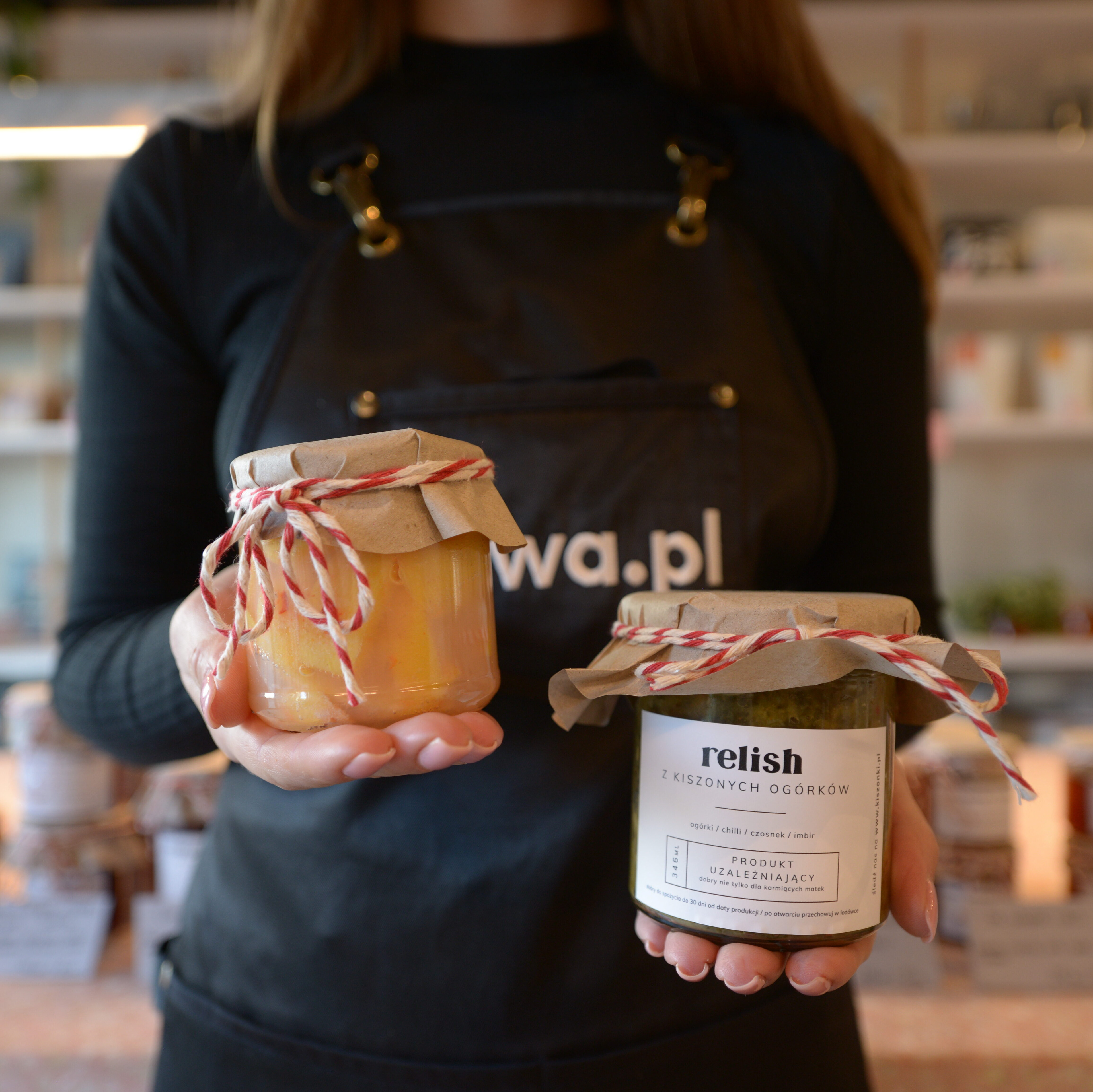
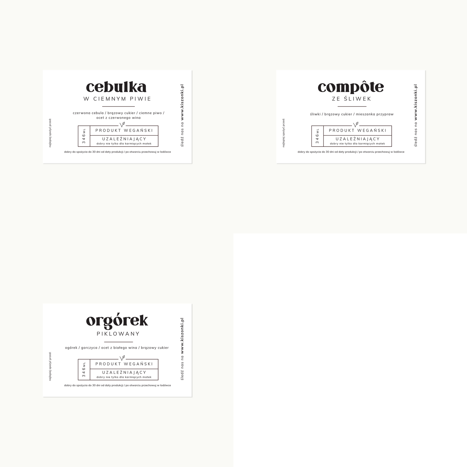
Creation: The design of the menu, posters, iconography and labels refers to the tasteful atmosphere of the interior of the cafe. Minimalism and careful selection of typefaces and colors are a reflection of tenderness and taste in the selection and preparation of products in the premises. The clear and calm space in the projects reflects the culinary pleasure you feel while tasting coffee and preserves from the "specialty" shelf.
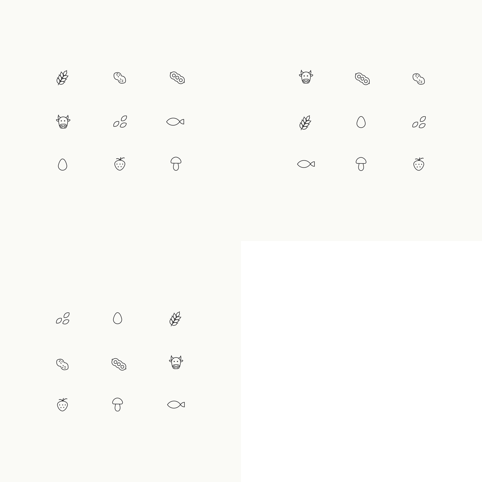

Scope of implementation: menu design selection of typography colors of advertising elements developing iconography and symbols in the menu and in the cafe space advertising poster design design and development of the concept of labels for products
Cooperation: The presented photos are courtesy of Kawa.pl
_____________________________
© stereoplan, 2020
